
Overview
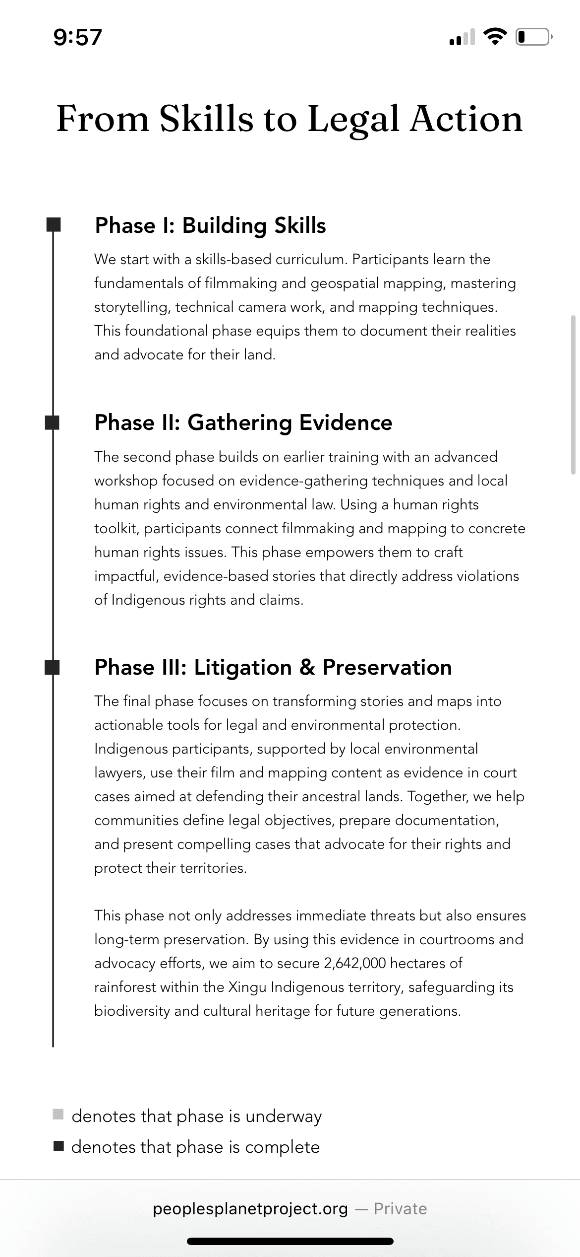
People’s Planet Project (PPP) is a nonprofit that teaches Indigenous communities filmmaking and geo-spatial mapping skills, empowering them to tell their own stories and advocate for their rights to land. I conducted an audit of website design platforms, then migrated their site to a new platform while implementing UX improvements and supporting a brand refresh.
Role
Digital Systems & Design Consultant
Tools
Figma
Wix Studio
Framer
Notion
Timeline
2 weeks
April 2025
CLient Problem
Big vision, constrained in execution
As People's Planet Project prepared for an international film festival circuit and fundraising campaign, their outdated website—built on the legacy Wix Editor—was falling short in reflecting their mission, engaging visitors, and showcasing visual content effectively. The client started redesigns within Wix Editor, but was struggling with the tool and needed help executing of their vision.

After meeting with the founder and head of marketing to learn about their mission, working processes, team capabilities, and ideas for a new website/brand identity, we broke the problem down to two core issues:
Limited Familiarity with Web Tools
The client had little prior experience with web design platforms and wasn’t fully aware of the capabilities or constraints of tools like Wix Editor. This made it difficult for them to both use the platform and evaluate whether it could support their goals.
Mismatch Between Tools and Expectations
Wix Editor is built for novice designers and lacks advanced layout and customization features. The client’s design references, however, were created with more sophisticated tools, leading to a gap between what they envisioned and what was technically feasible on their existing platform.
Key Limitations
It's a good thing constraints force creativity!
Two-week timeline
With publicity events already scheduled, the client set an ambitious timeline of getting the website up in two weeks.

Specific design requirements
The platform had to support their storytelling needs—carousels, integrations, and custom layouts—to effectively represent their brand.

Platform must be no code
The client wanted a lot of control over the design, but did not have a developer to build the site from scratch, nor the resources to bring one on for future maintenance.
Process
Platform Audit
The goal of the audit was to learn Wix Editor's capabilities and research alternative platforms that may better serve our client's needs.
Based on the limitations, most options did not warrant the effort of switching to a new platform. While familiarizing myself with Wix Editor, I discovered that Wix has a newer platform, called Wix Studio, that is a lot more powerful and allows non-developers to have more extensive control over designs.

Of the outside options, I conducted more extensive testing and evaluation on Framer and Wix Studio.
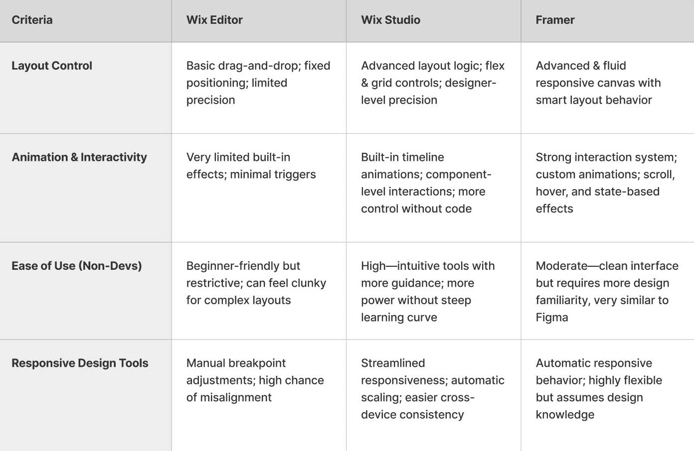
Migration to Wix Studio
Despite the added effort within a tight timeframe, I recommended moving forward with the migration. The client had outgrown Wix Editor— its limitations were already creating friction in translating their brand into a web experience. Tackling the switch now, ahead of impending increases in site visits, would give them the most flexibility moving forward.
Rationale
1. Minimize new learning curve by going Wix to Wix
2. No-code, but still increases design capabilities
Drawbacks
1. Still a manual migration—can't convert a Wix Editor file to Wix Studio
Shortened timeline for design execution
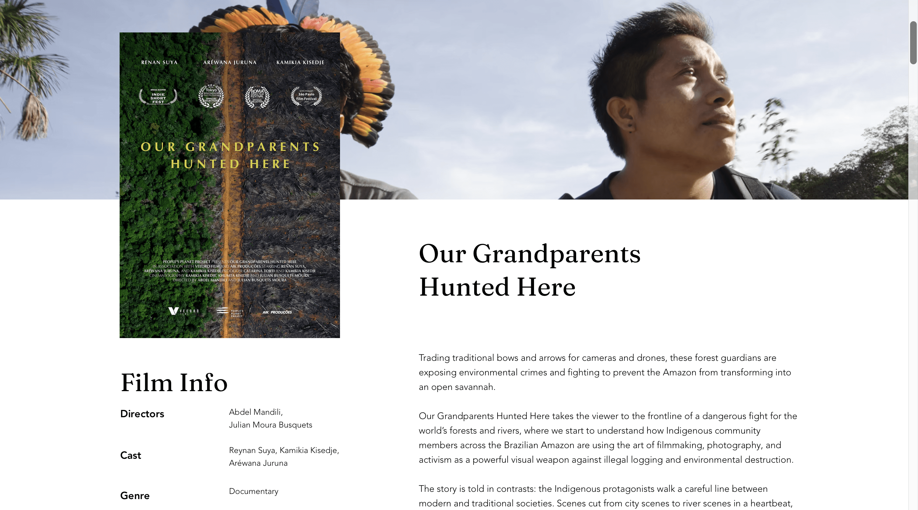
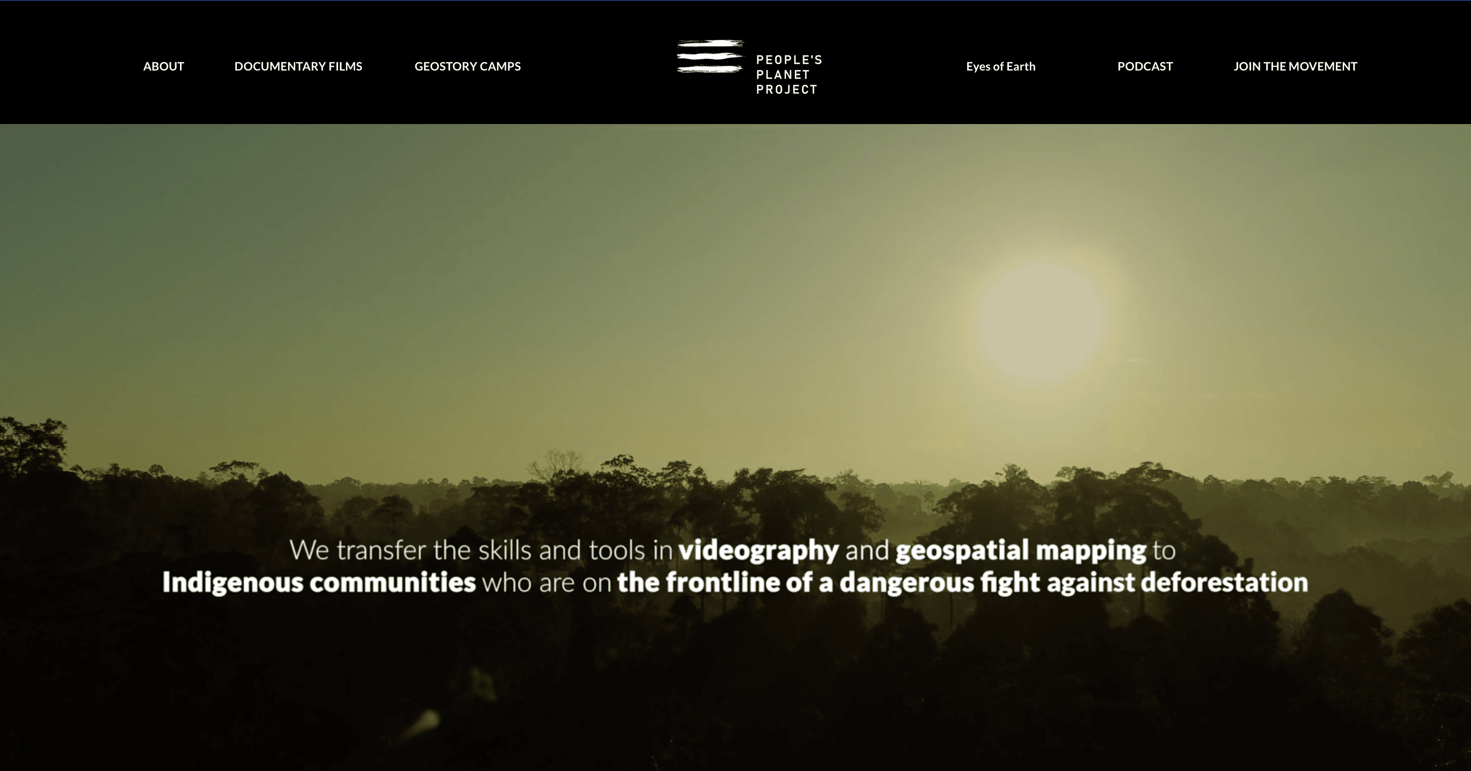
The final site showcases People’s Planet Project’s new visual identity, including improvements to overall user experience and brand consistency.
Optimized across mobile and tablet, it supports the high volume of users landing from social channels
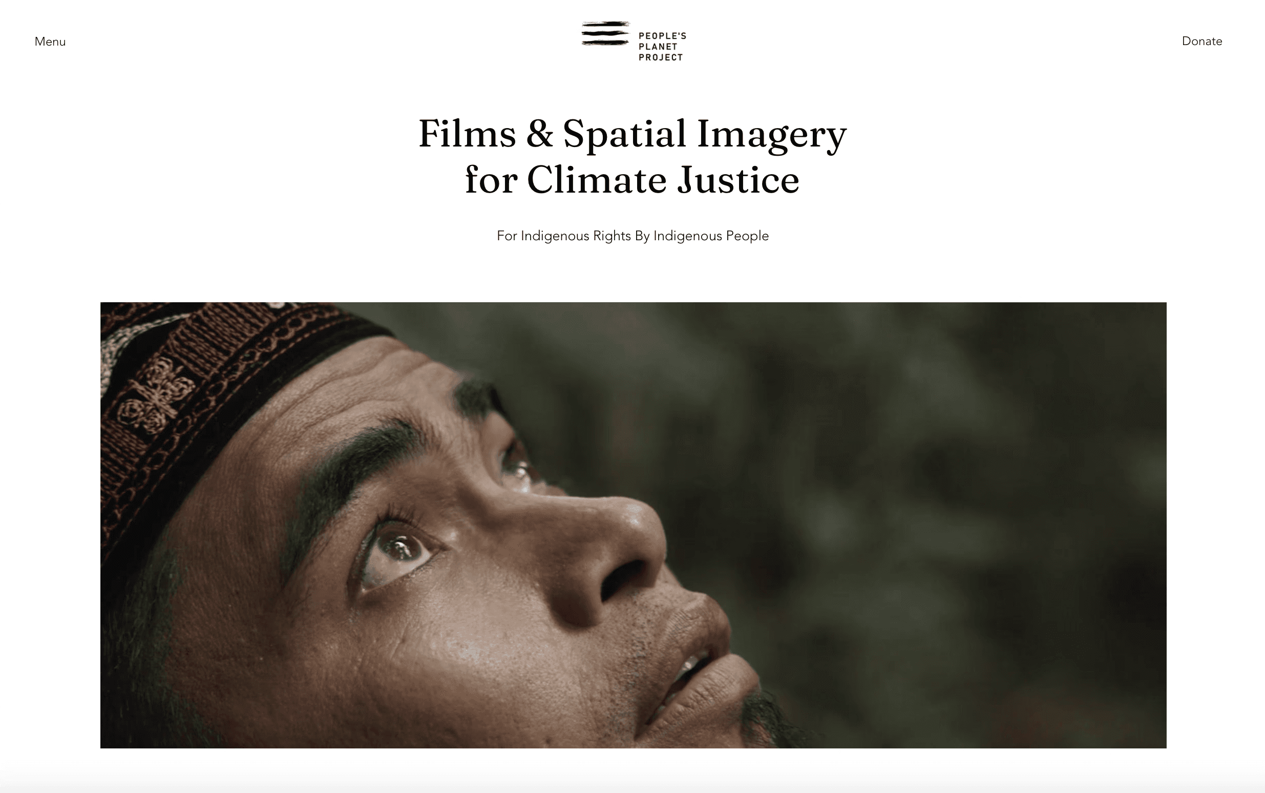
A clean editorial aesthetic simplifies communication of the nonprofit's goals and work.

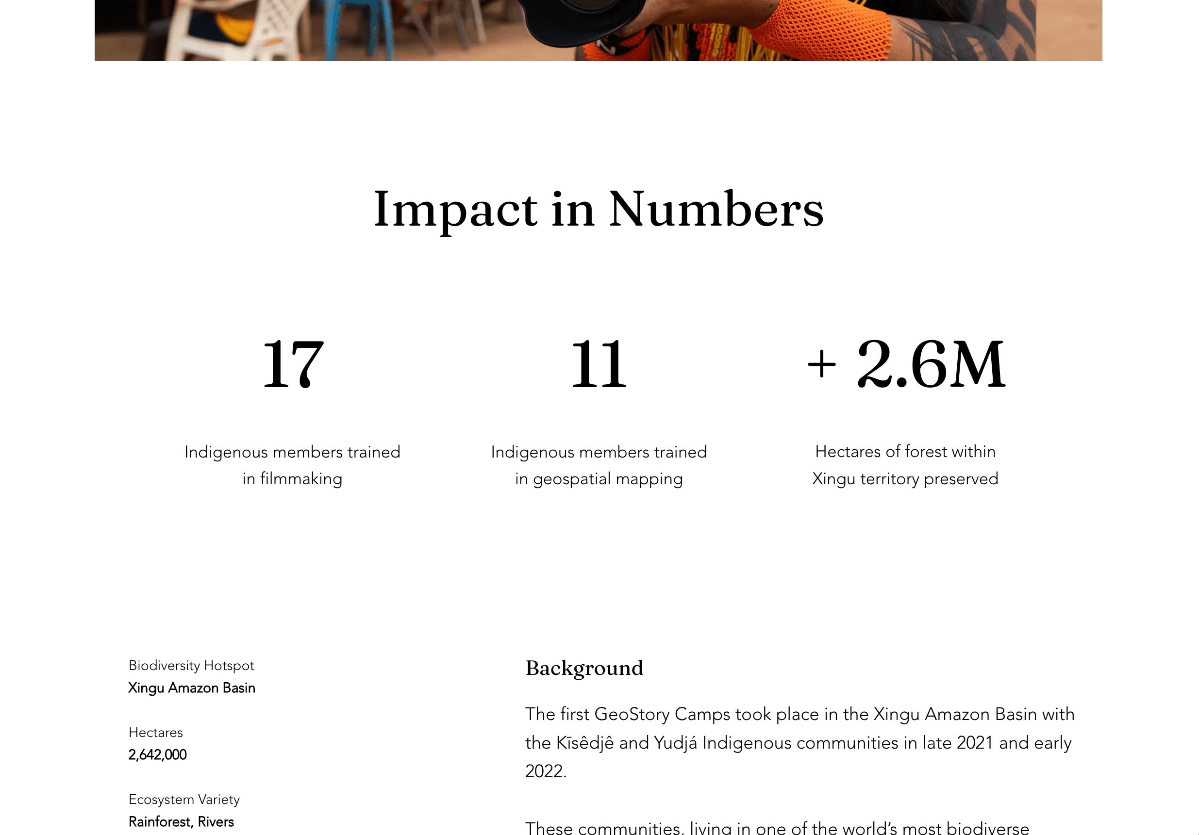


This new instance enables donations through a third-party integration & features responsive diagrams for all devices.

Learnings
Prioritize real-time communication
Working offline and hoping the design “speaks for itself” doesn’t work—especially when some of the most thoughtful decisions are about what not to include. On calls, communicating more than what I thought was necessary is actually necessary. Live reviews allowed me to explain some of the invisible decisions, like elements intentionally left out, which helped the client see the full picture of my work.
Defend your decisions, but stay open-minded
I was challenged a lot throughout this design process, with feedback ranging from “we just don’t like it”, to "the experience is disjointed". I learned the importance of explaining why I made certain choices, and having a clear rationale rooted in UX and brand strategy to back up those choices. Ultimately, this pushback resulted in a more cohesive and polished final design.
Build trust through shared purpose
This experience taught me that aligning with a client’s mission can be a powerful way to bridge differences in design vision. Building a deep understanding of what they were trying to achieve helped me better guide design decisions—and helped them trust my judgment more.