

Overview
Eclipse Soundscapes is a NASA Citizen Science Project, an initiative encouraging people of all ages and backgrounds to take part in scientific research. The project studies how eclipses affect life on earth, relying on volunteers from around the world to document and share their multi-sensory eclipse experiences.
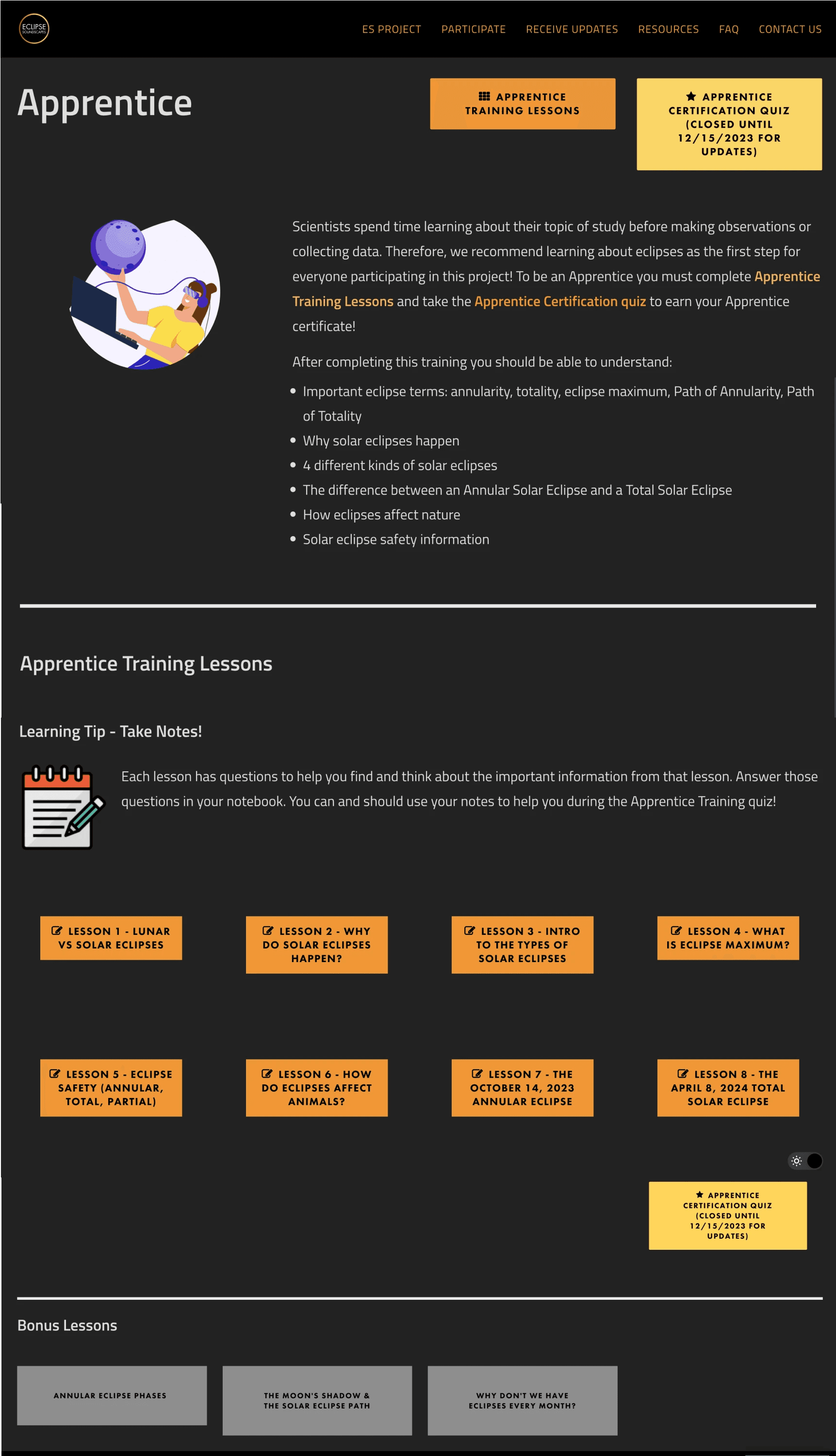
Our client, Arisa Labs, came to us for help improving the screenreader experience and driving engagement on their website ahead of the April 2024 eclipse. All team members conducted user interviews, heuristic evaluations, and user testing. I mapped out the user journey, conducted competitive research, wire-framed the Apprentice page, and marked the tab order on our final designs.
Role
UX Designer
Team
2 UX Designers
1 stakeholder
Tools
Figma
Stark
VoiceOver
Timeline
5 weeks
Nov - Dec 2023
Background
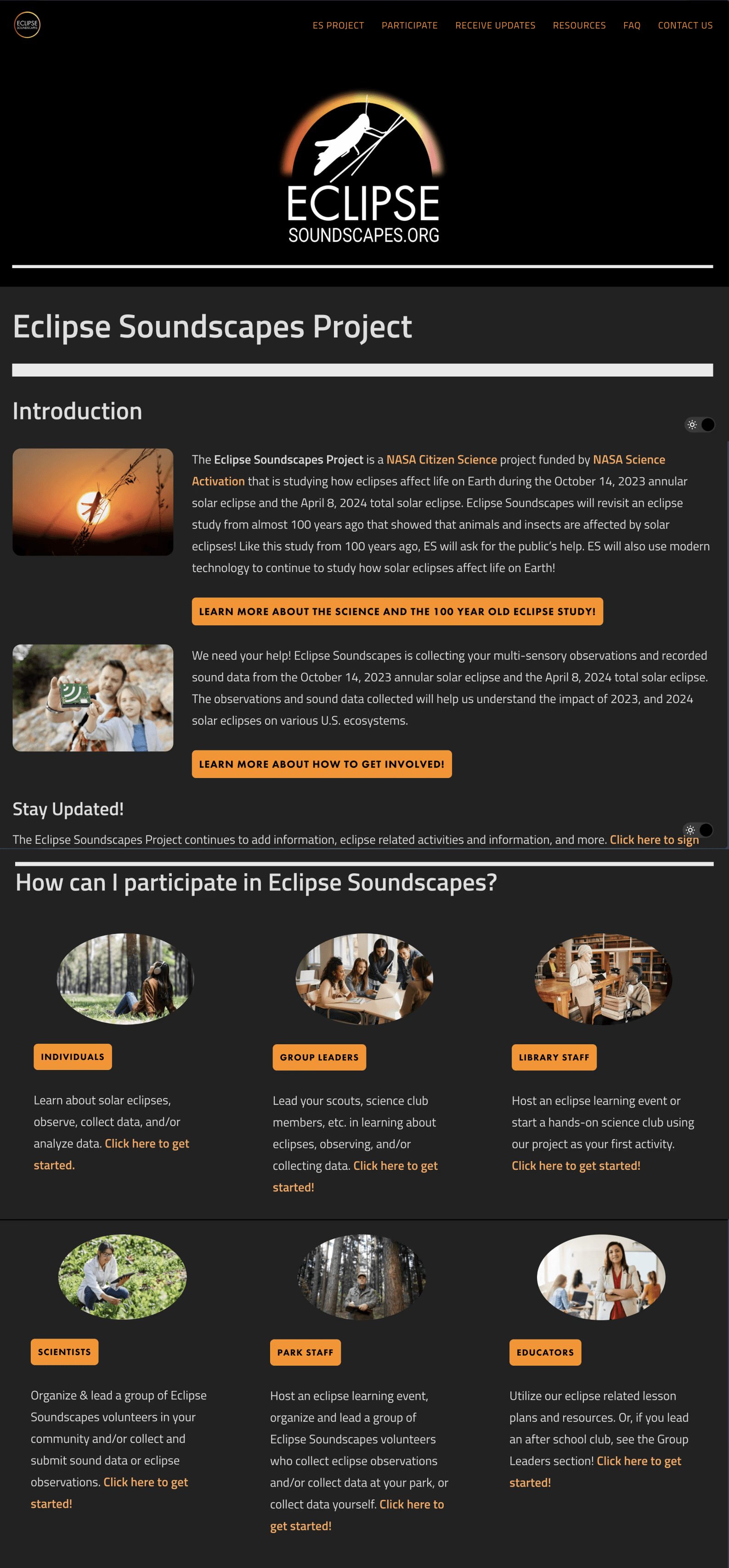
Given the Eclipse Soundscapes Project's emphasis on collecting auditory data and observations, blind and low-vision individuals, as well as sighted individuals, have the opportunity to participate in their research. This means volunteers navigate the webpage both with and without a screen reader.
When Arisa Labs came to us, they had not done any auditing of the site experience via screen reader. We were tasked with exploring how all users—including low vision and blind users—can more easily learn about, get certified, and sign up to be an Apprentice.
Discovery
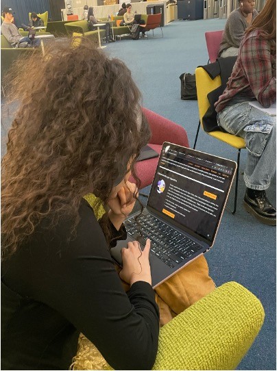
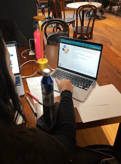
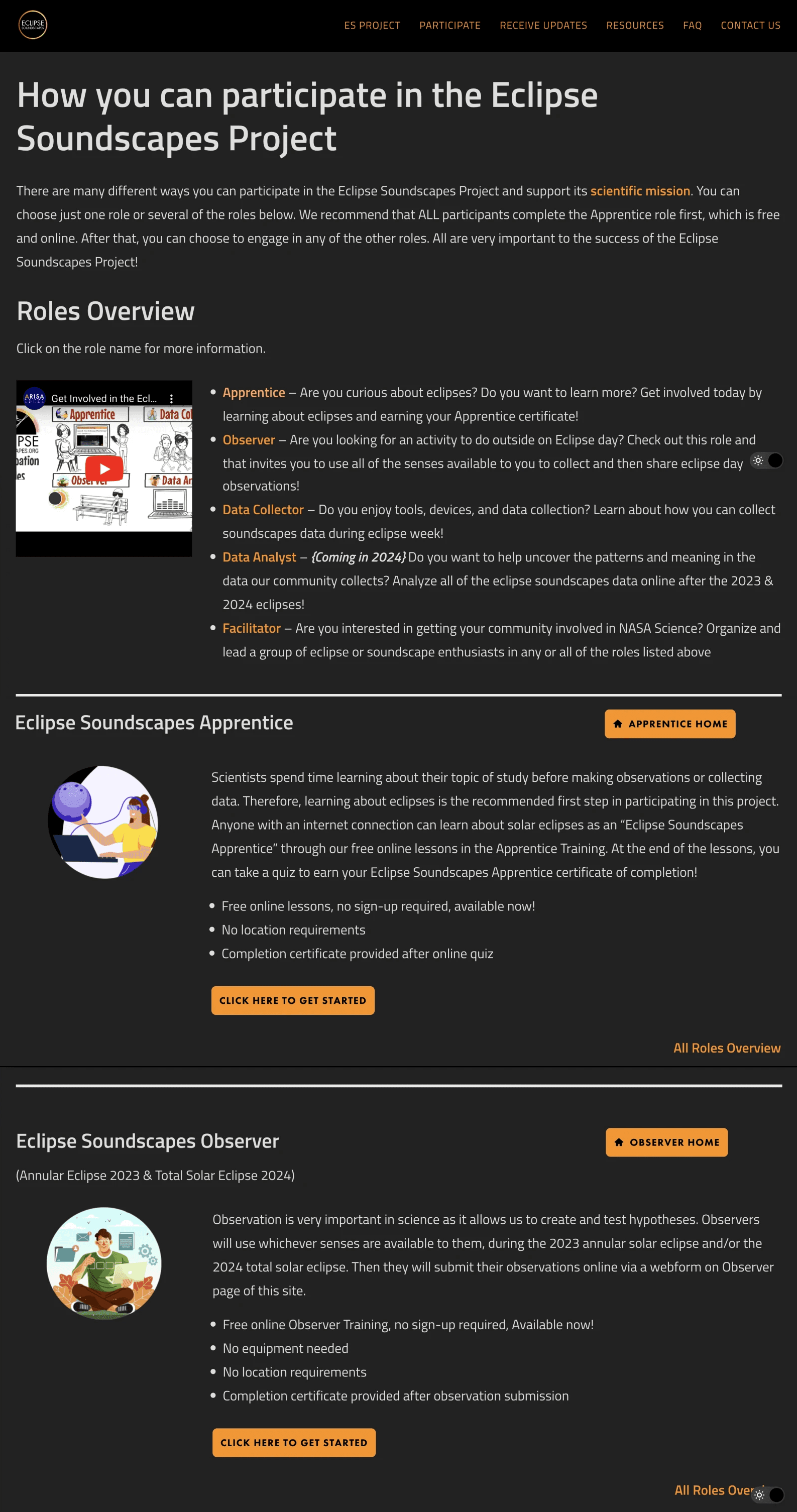
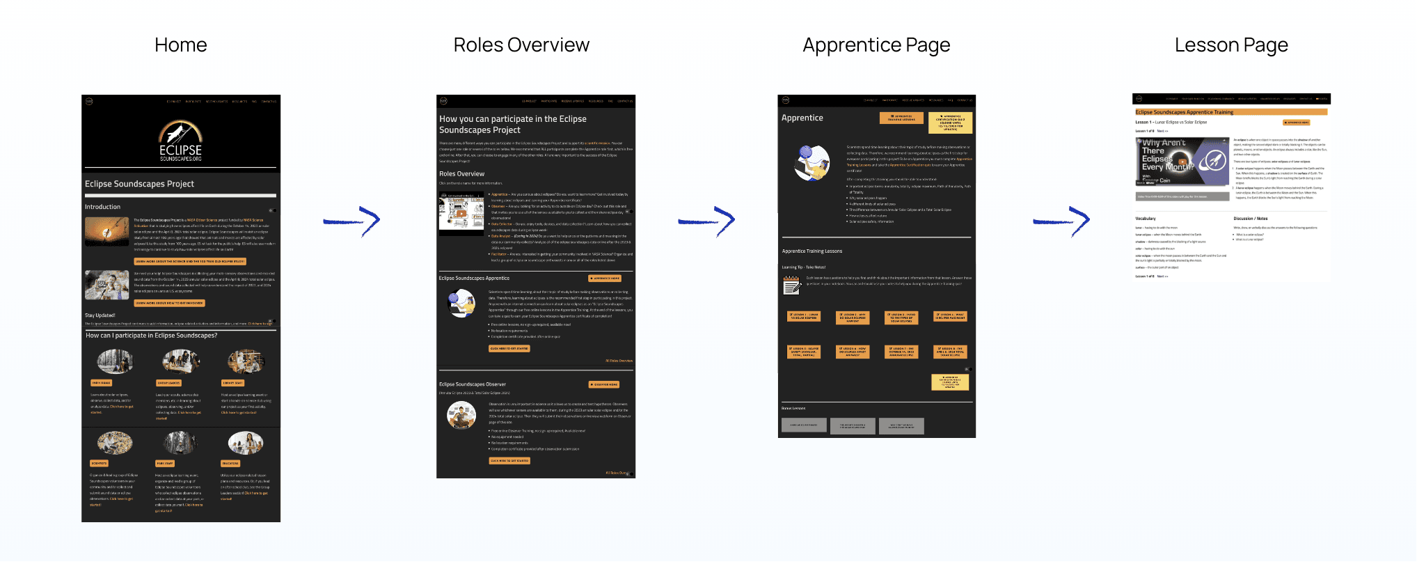
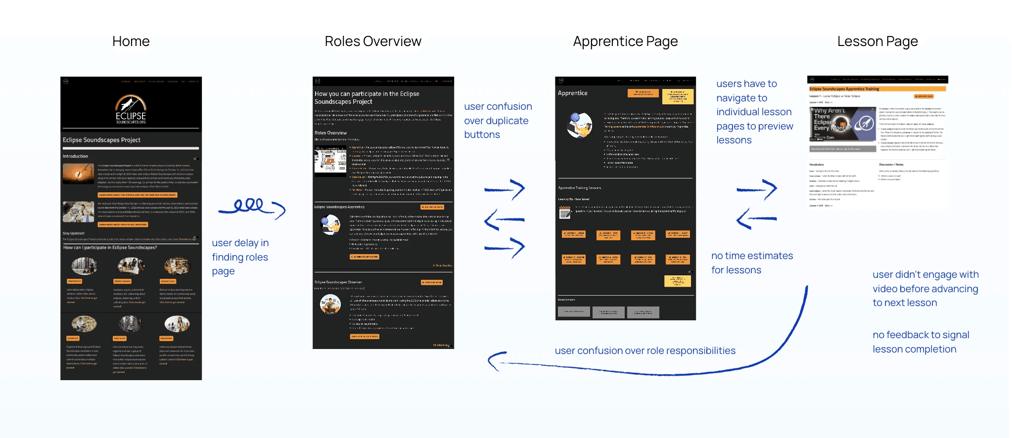
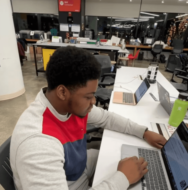
To understand how a prospective volunteer would approach getting involved, we asked 5 users to start from the home page and work towards becoming an Apprentice, noting pain points across the journey. Afterwards, we interviewed each user about their experience.
Actual Journey
Key information is missing or buried across pages
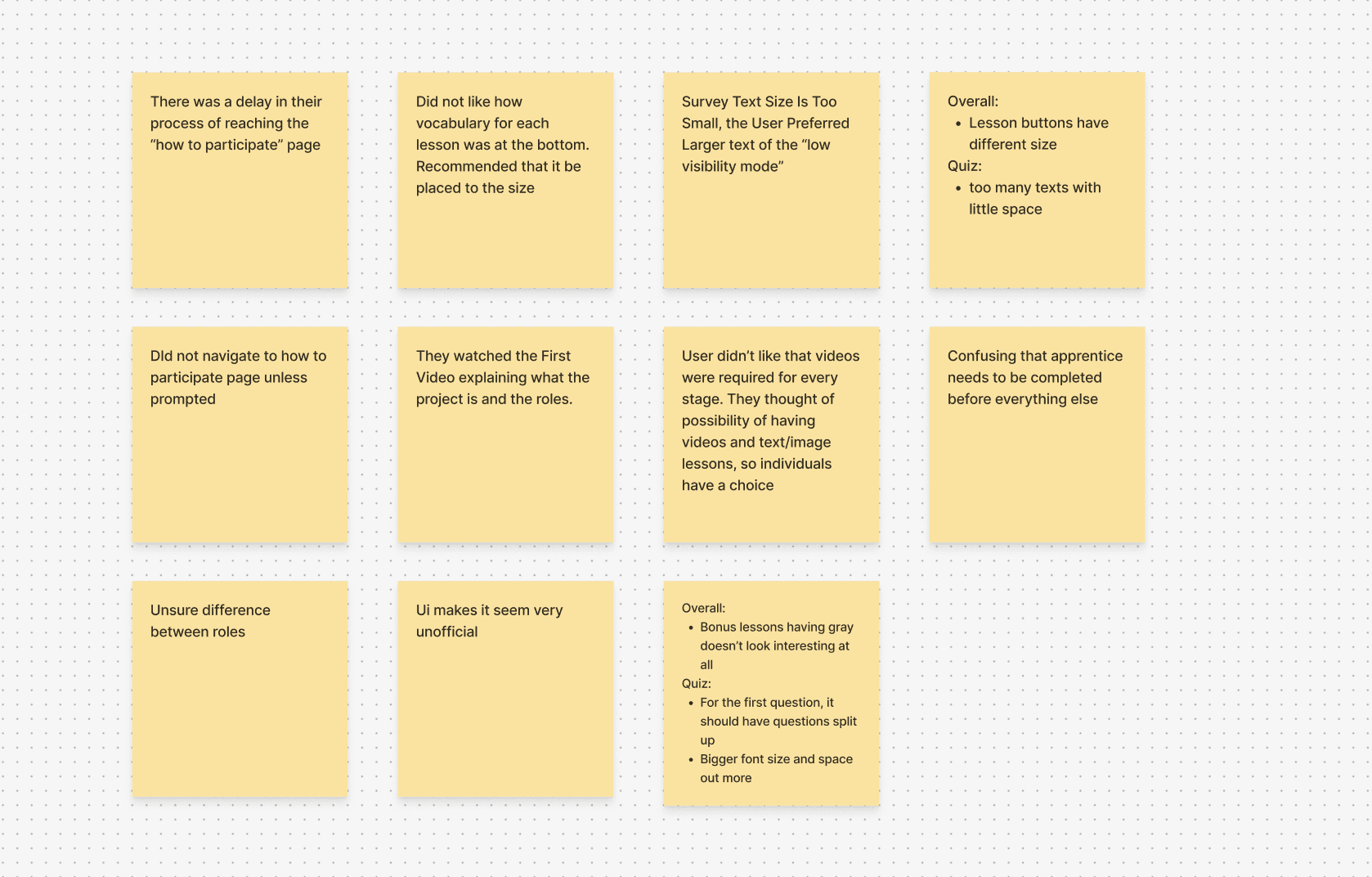
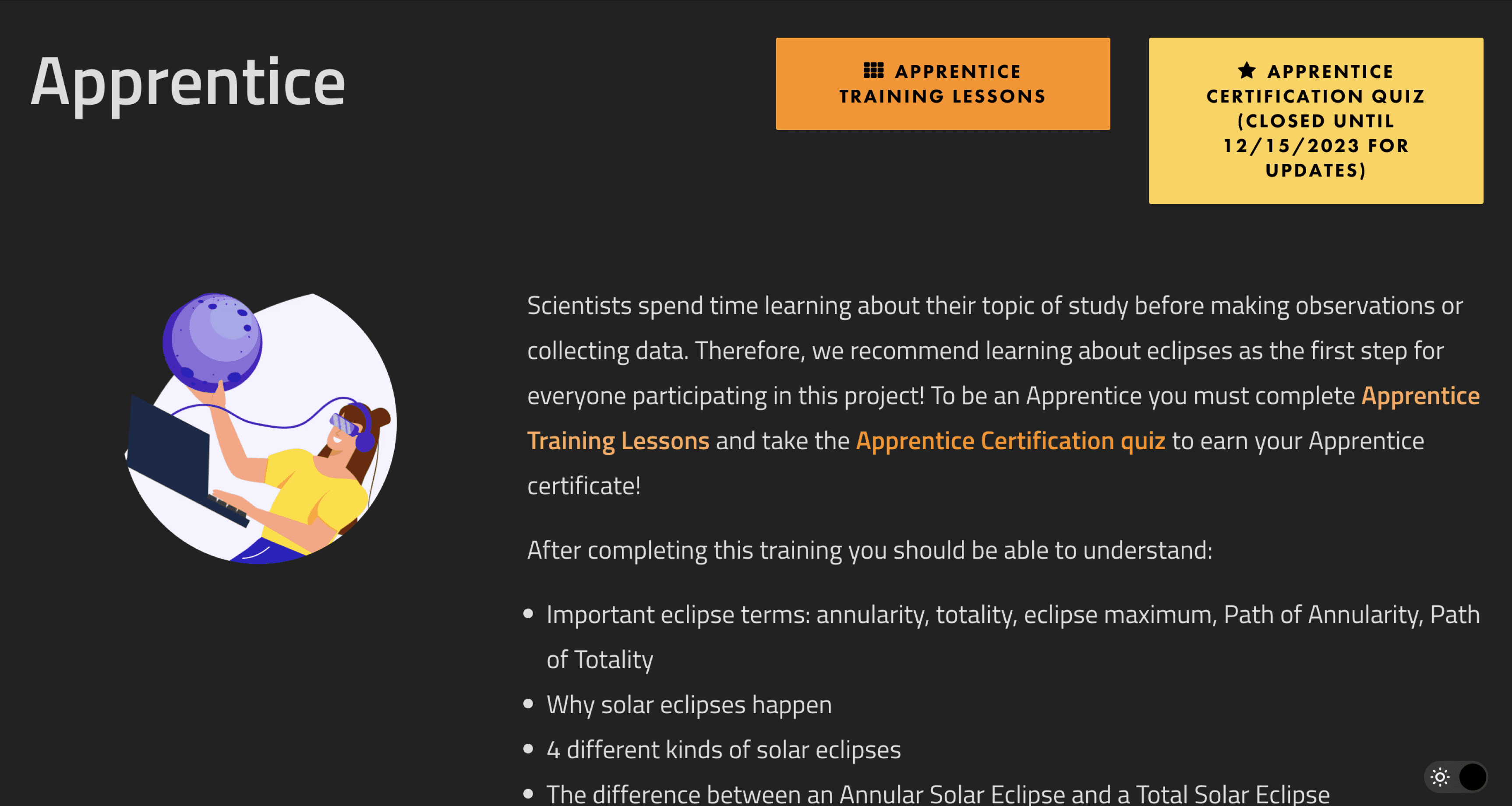
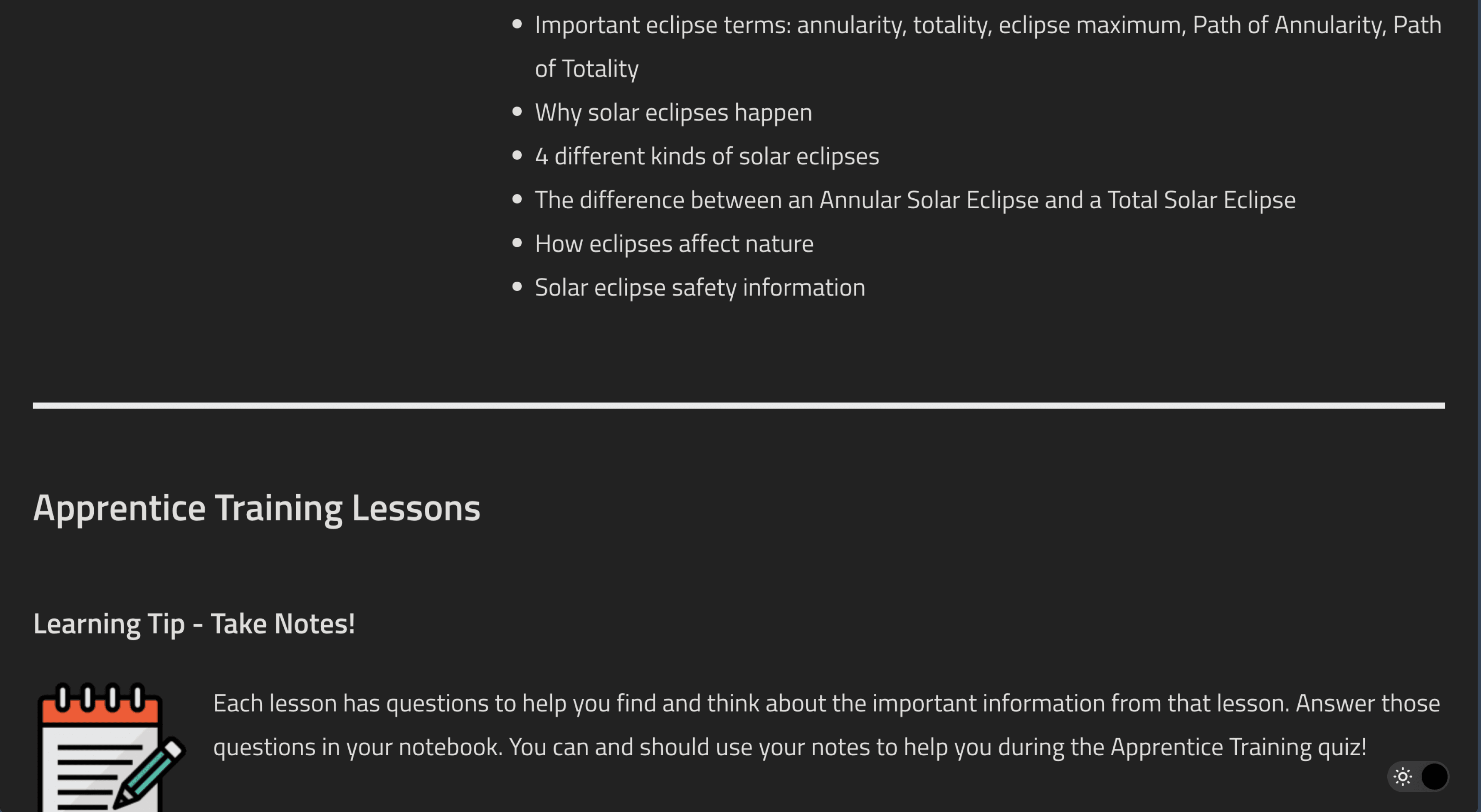
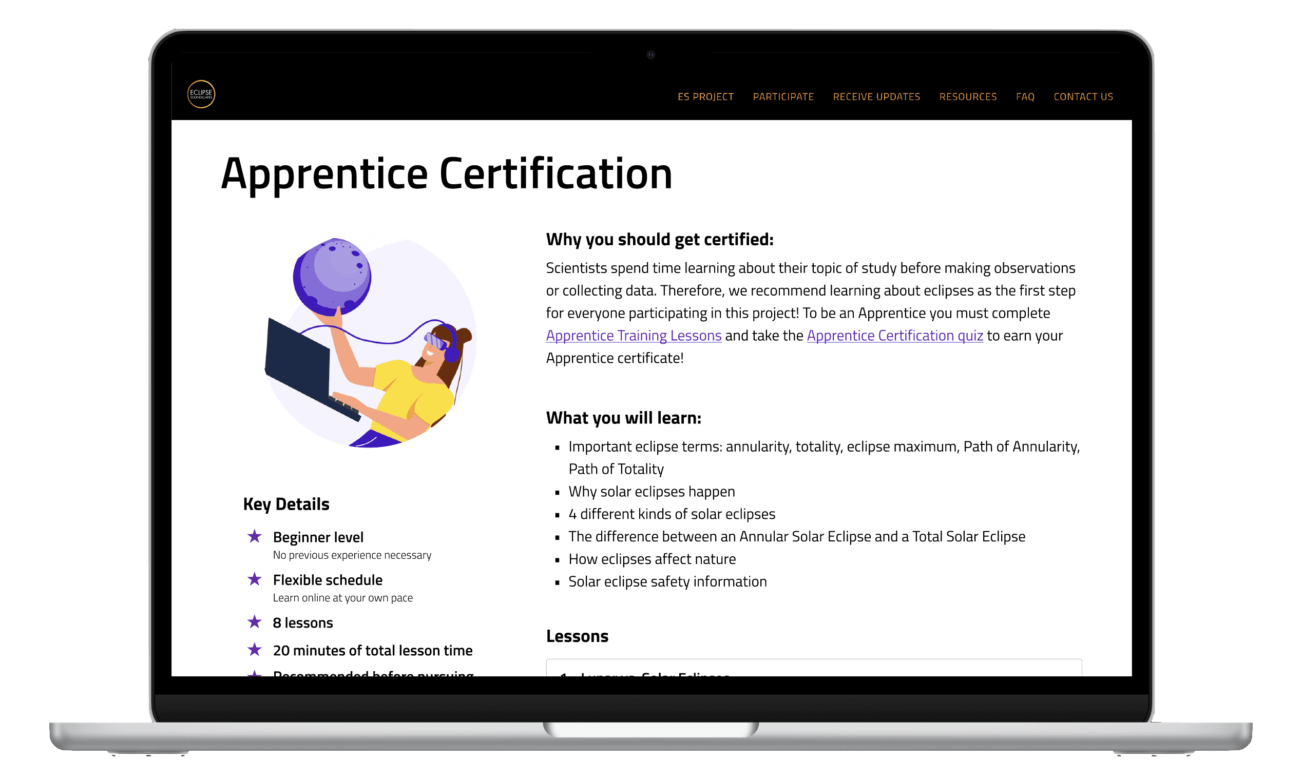
Users navigated back and forth between pages to understand the Apprentice certification process. They sought out lesson previews and time commitment estimates, missing from the site. One user said "it didn't seem clear at first why I should do the Apprentice training before the others."
Video content is skipped over
When skimming pages for information, users often skipped over videos missing large parts of relevant content that was only accessible by video.
UI is deterring motivation to get certified
In interviews, sighted users mentioned lack of trust in the curriculum due to the "unofficial" feel of the UI. They voiced opting for a "more legit certification" instead if they really want to learn about eclipses.
Challenge
Process
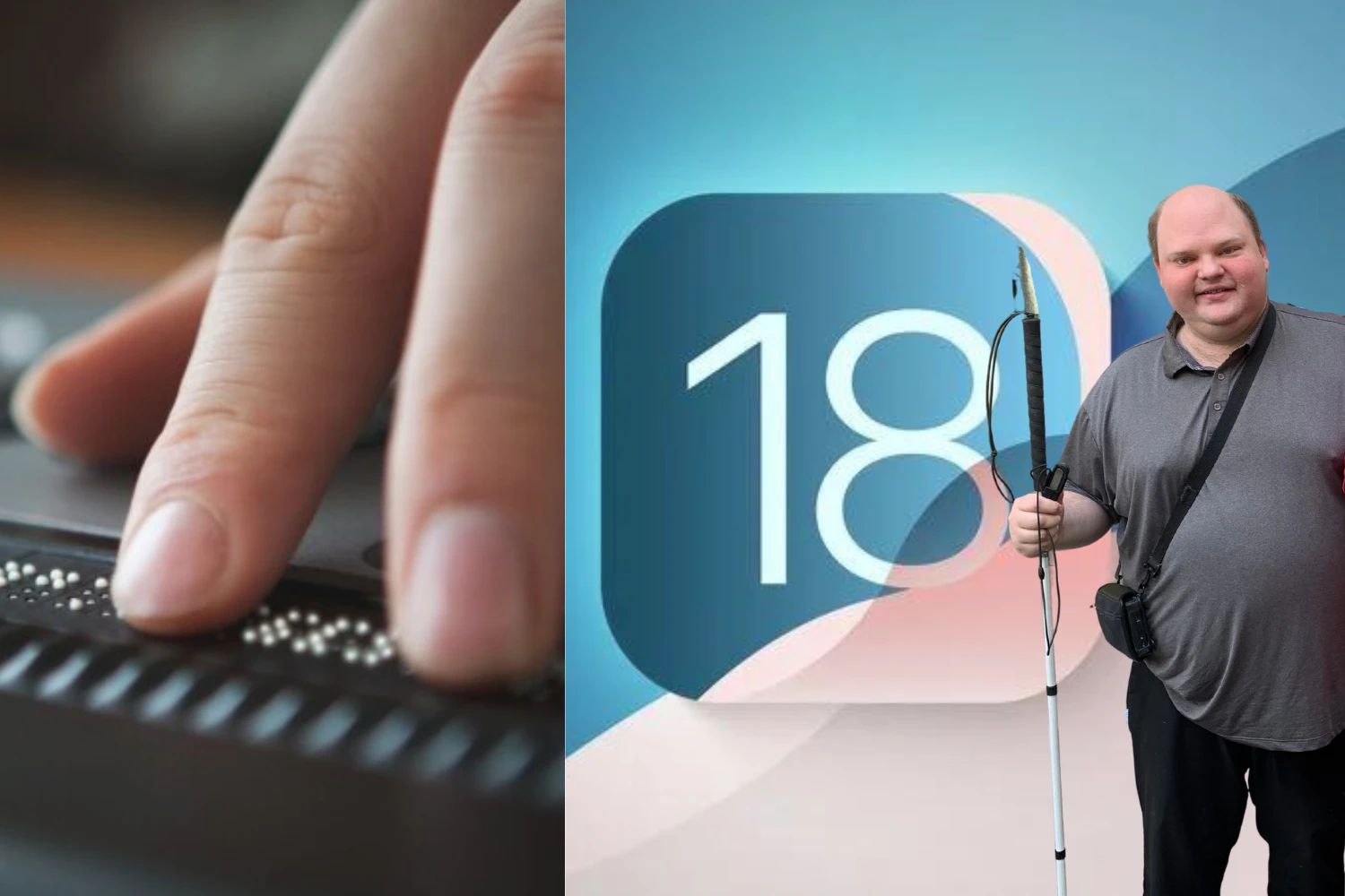
As a team of sighted individuals designing for both sighted and blind/low-vision users, we were guided through navigating our computers and the web via VoiceOver (screen reader built into IOS devices) by a representative from the Helen Keller Services for the Blind, an organization promoting adoption and use of assistive technology.
Their expertise allowed us to perform a more comprehensive analysis of the site's screen reader accessibility that included notes on tab order, alternative text, and color contrast.

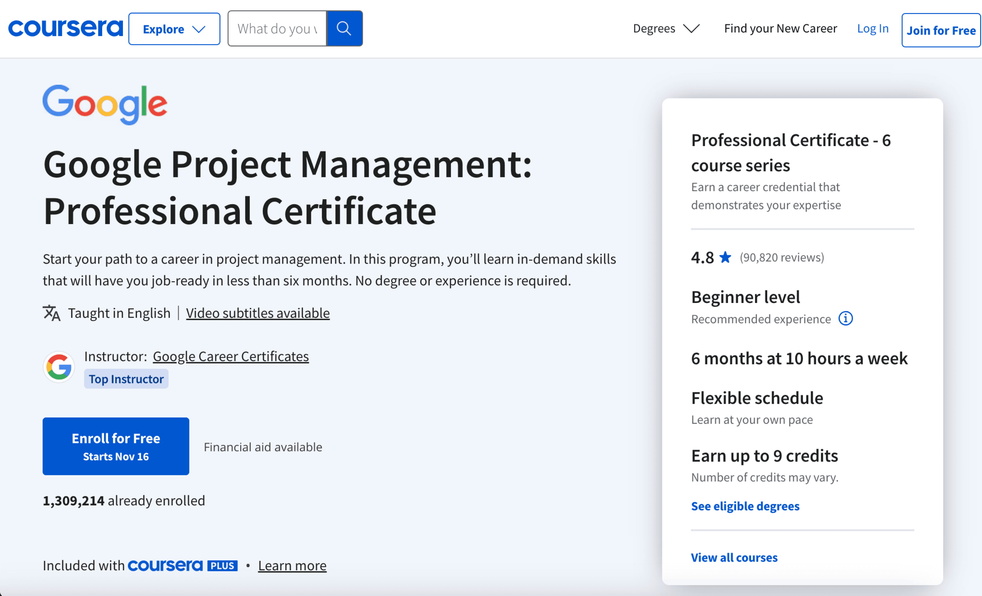
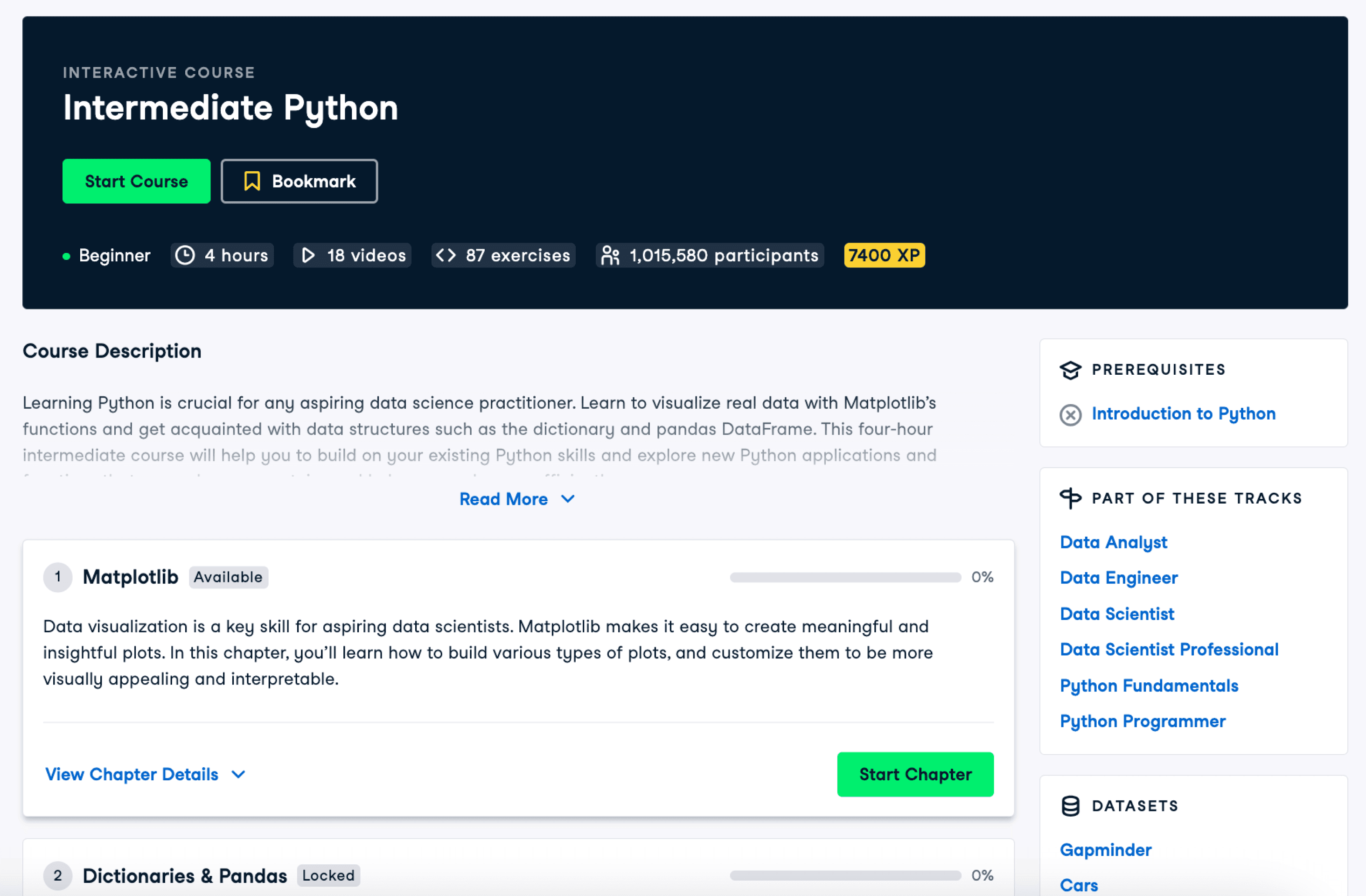
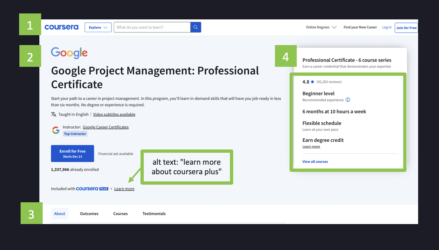
After understanding of the scope of the problem, we dove into researching what an online learning program could look like, conducting competitor research on sites offering courses and certifications. This also allowed us to investigate how similar sites translated their visual layouts to the screenreader experience.
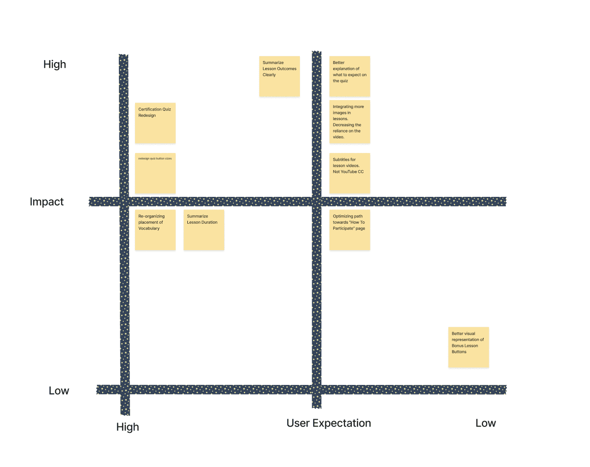
Bringing together our conclusions from user tests, accessibility audits, and competitor research, we found many areas of potential focus for the redesign.
After discussing feasibility and priorities with our client, we landed on two main areas to guide feature exploration:
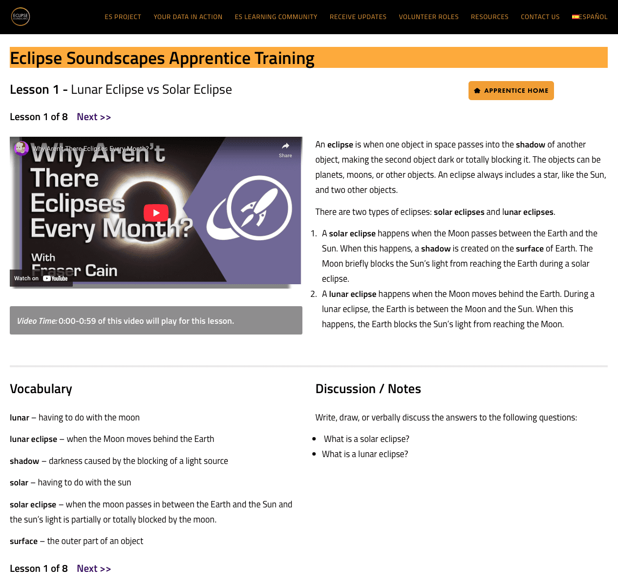
Improving lesson and course content organization to make the page information more digestible.
Adding transcript or text option for videos to give users an alternate option for learning information.
DesignS
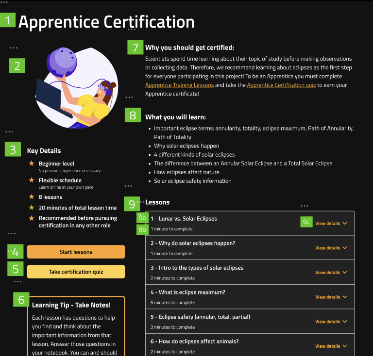
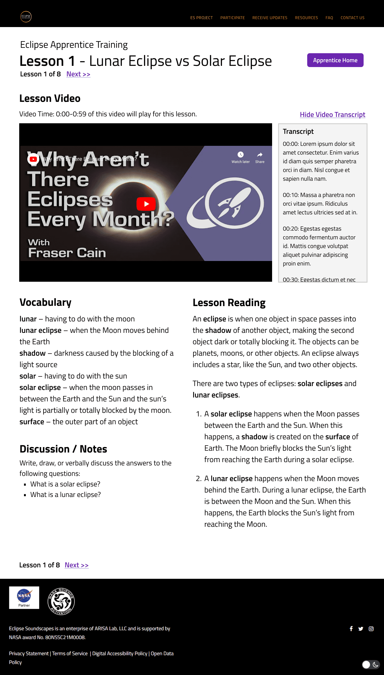
Lesson information is organized under section headings for easy page scanning. Green boxes denote the order of headings in the screenreader experience, which can be used to used as a guide for tab order when assigning HTML tags.
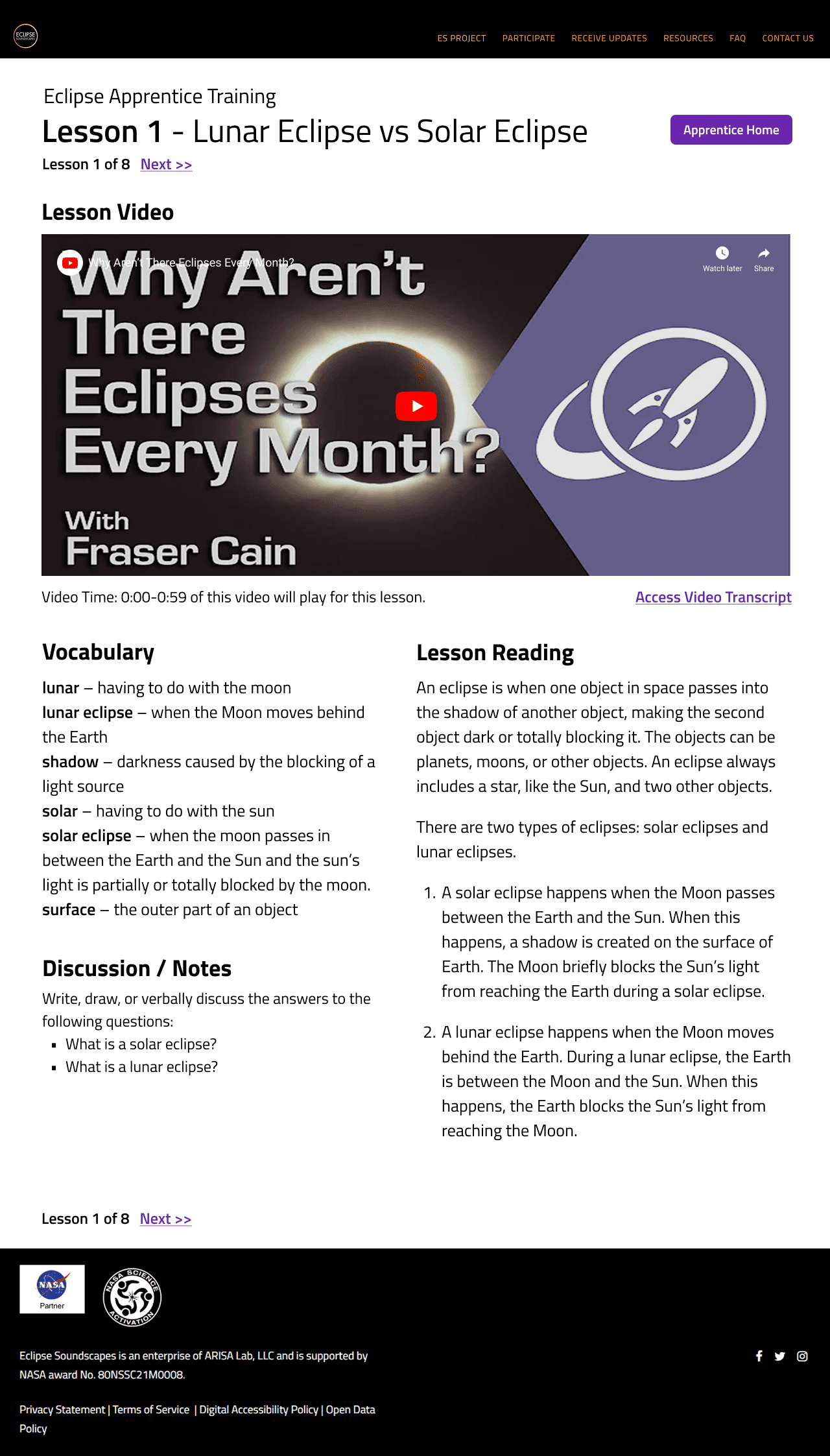
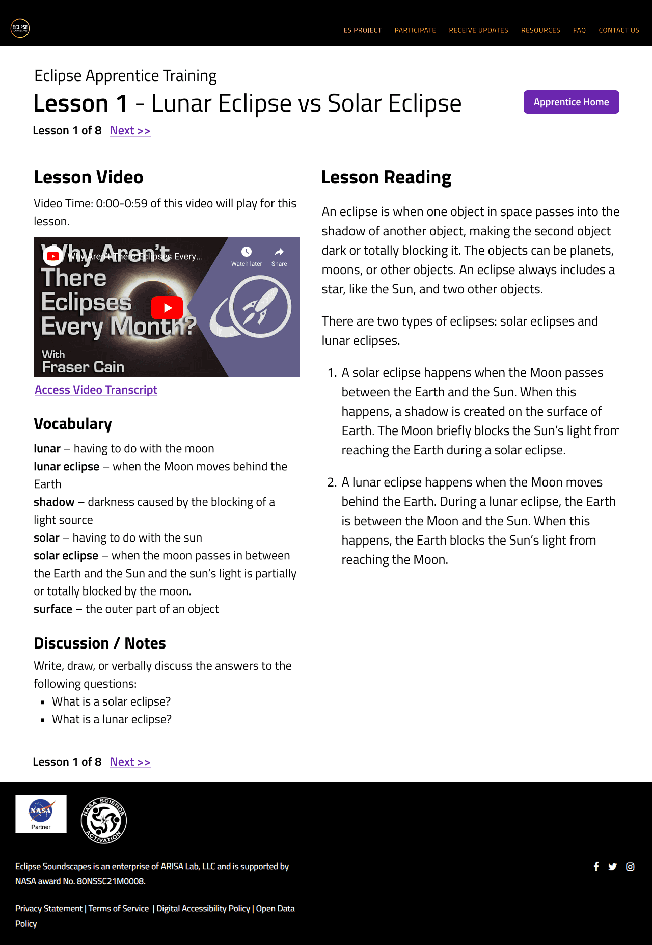
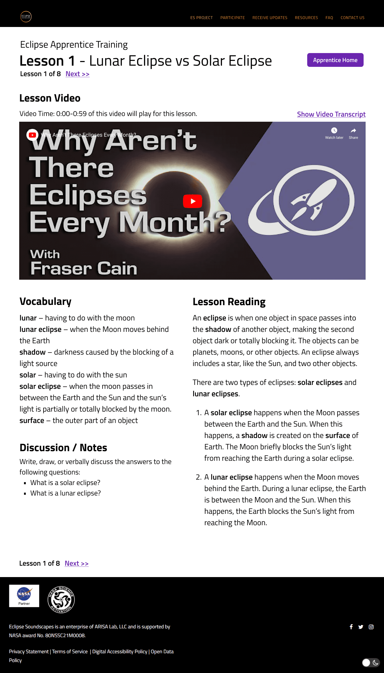
We tested two layouts for the lesson page design. Version A resembles the former layout, while version B highlights the video player. Both versions have the former content broken into sections under new headings.
Design Rationale: The former layout where lesson video and reading are placed side by side may have led users to assume the video was redundant, skipping over it. We wanted to test whether enlarging the video player would change user behavior.
A/B testing with 5 users confirmed that version B was preferable to version A. Users skipped over the video less often, and some also commented that they liked having the lesson text next to the vocabulary bank so they could refer to it as they read.
Next Steps & Learnings
Introducing too many changes at once made it very difficult to pinpoint which ones are working and which are not. If we had more time, we would have tested more often throughout the design process. Ideally, we would want to conduct more isolated final testing (for example, focusing only on layout or the lessons widget) to confirm our results.
Oftentimes, we were faced with conflicting user feedback and unsure the best way to proceed. Discussing our inconclusive research with our client gave us important redirection and clarity throughout the design process. This was a good reminder that design is a collaborative practice, and a healthy dose of doubt is necessary in prudent decision-making. While we were the experts on digital design, we were not the experts on the organizations mission and purpose. Constant communication and two-way learning led to this project's success.
nicolehu9@gmail.com
Thanks for visiting!

